These 8 Cyrillic fonts are pro, open-source and flawless (and with no competition)
Design picks & tips with Asta studio. This read will highlight 8 of the most significant and free-for-all Cyrillic font families that have come into play in recent years and changed the game
The days when Helvetica was a symbol of courageous and professional design are long gone. I myself haven’t used it for over 10 years. Aside from that, the Google Fonts library has contributed to the fact that free fonts can be found everywhere on the web and few companies and designers today are willing to pay for fonts to create and solidify their brand and corporate identity. More importantly, the new open-source font families that are catching on and making their way to the top receive their Cyrillic support in a timely manner. They're all so great and professionally outstanding that it's almost impossible to choose just one favorite when you know all the cool fonts out there. We all don't have enough projects to honor them all the way they deserve.
Listed here are the font families that have definitely earned my respect for a while, and the fact that they support Cyrillic is just perfect. Creating a brand identity for a client is now easy knowing that the fonts you choose for their local (Bulgarian) and international content and presence do not need to be combined with additional Cyrillic fonts. What I had to do not long ago 🤭
It's the 3rd paragraph and now it's time to say that in this article I will share some personal opinions and insights about typography as well as reflections on the Cyrillic alphabet from my career as a graphic designer. All complemented by some cool resources on the internet to make the article a great read and worth learning from and sharing.
All equally cool and of the highest quality, it is a compilation of 8 Cyrillic font families in alphabetical order:
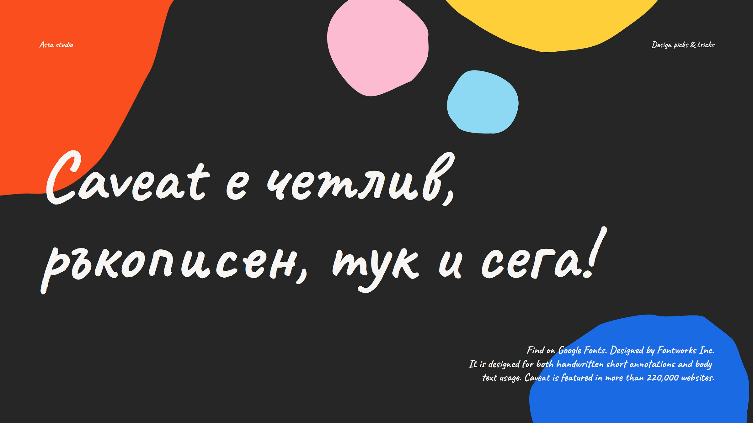
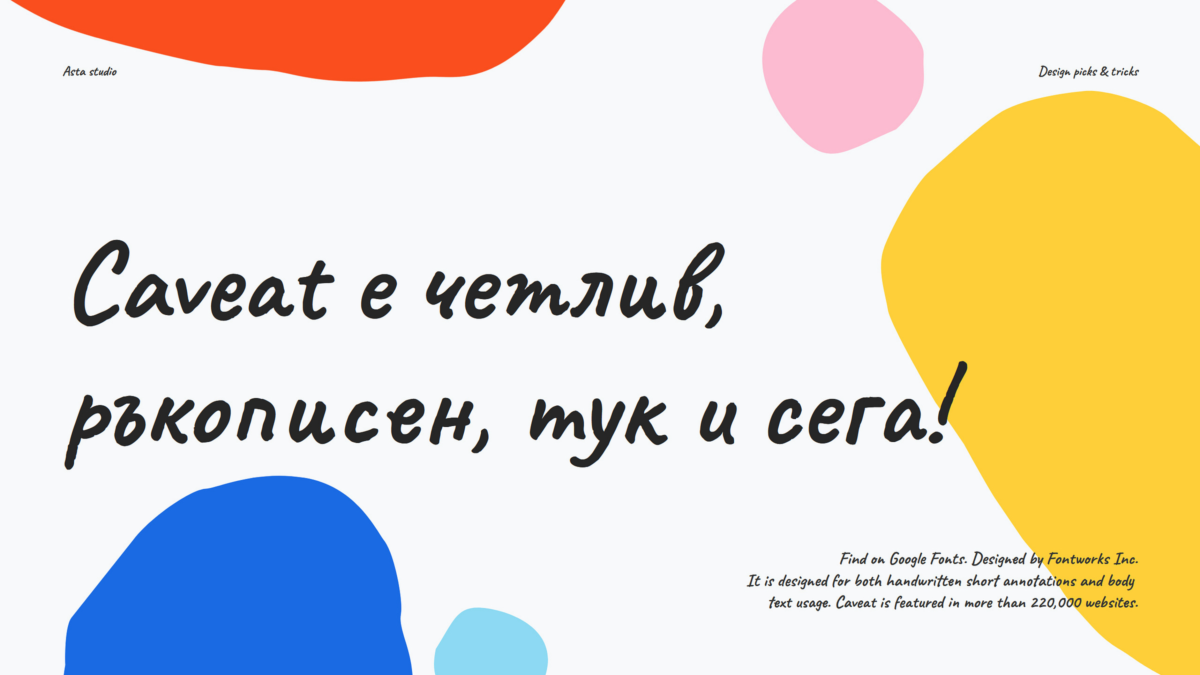
Caveat
Designed by Pablo Impallari / ImpallariType 🔗; or Find on Google Fonts 🔗
Caveat fonts (Regular 400; Medium 500; SemiBold 600 and Bold 700) are gaining popularity day by day, conquering the internet and fans with their rawness and sincere cursive writing. Caveat has a simple, distinctive and even quirky design. 🤟
Caveat offers four width variations to choose from and all glyphs come in three shapes, also known as contextual alternates. That said, you won't make a bad choice if you decide to use it to create your next project, as it can handle long paragraphs, full-page text, or short texts like titles, taglines, or quotes. In two words ideal for both <title> and <body text> 🤭
As a usage tip, I would say that Caveat fits perfectly with the style and brand identity of: It fits any project or brand aimed at children and young people; I think its organic appeal suits all eco-friendly, down-to-earth and green positive activities and brings their message to the public; It is perfect for your life and inspirational quotes that you share on social media; Author websites and blogs; or your online diary, where you keep a journal about a mistake you made and what you learned from it; I see it on your mother's home-cooked food book; There are endless possibilities, I see no limits unless you are a bold corporation, an institution or a fin-tech company.
Don’t miss having that one! ☺️
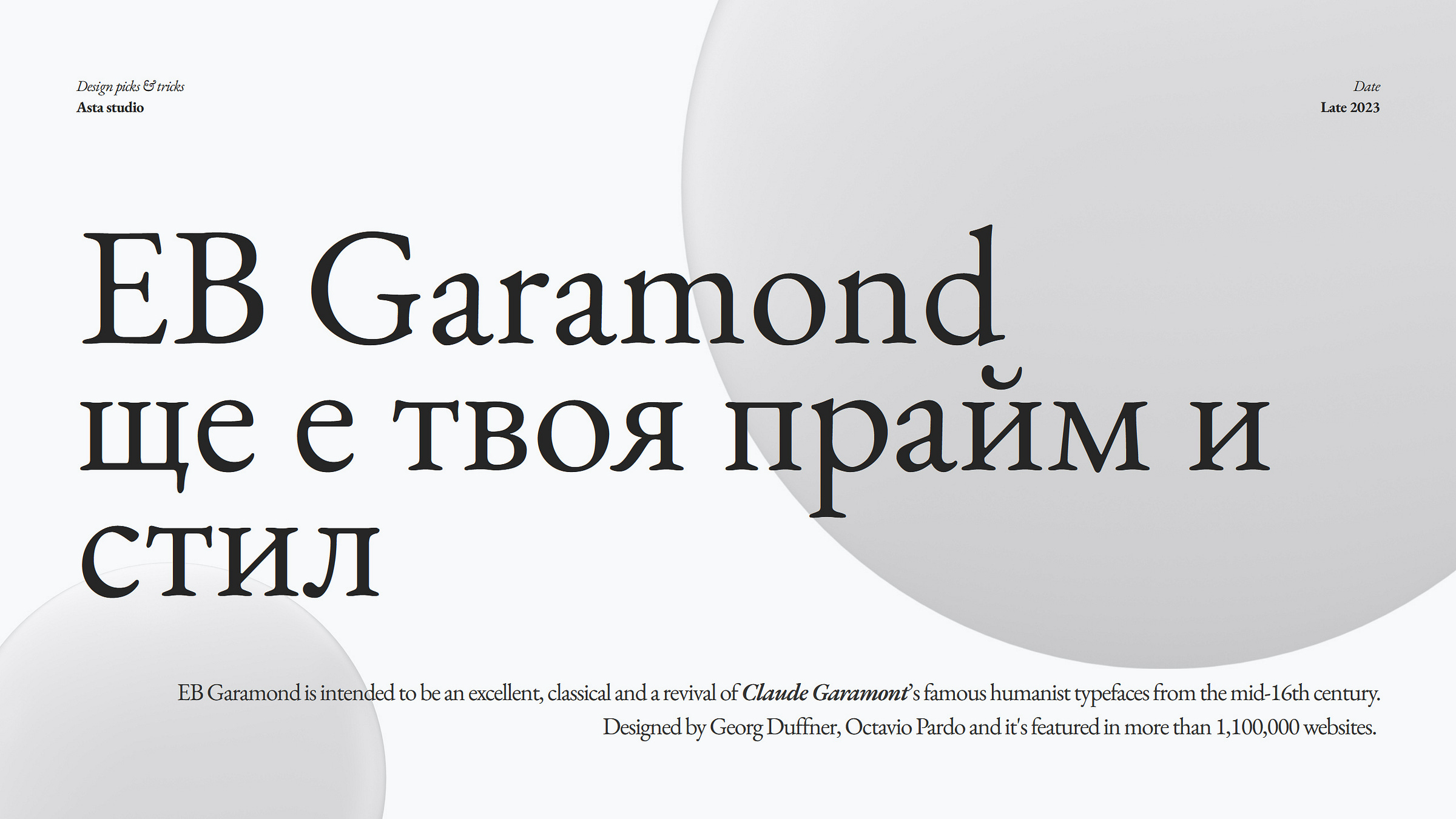
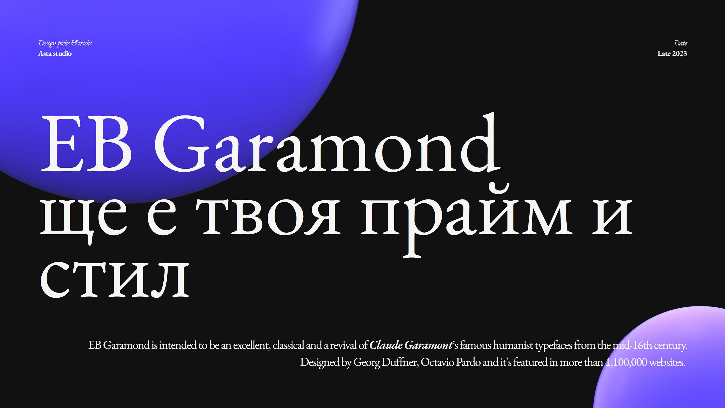
EB Garamond
Designed by Georg Duffner, Octavio Pardo / georgduffner.at/ebgaramond 🔗; or Find on Google Fonts 🔗
EB Garamond is an open source project (Regular 400; Regular 400 Italic; Medium 500; Medium 500 Italic; SemiBold 600; SemiBold 600 Italic; Bold 700; Bold 700 Italic; ExtraBold 800 and ExtraBold 800 Italic) to revive Claude Garamont's famous humanist typeface from the mid-16th century. It is a classic, old-style serif font whose history and scope are unique, so EB Garamond will remain the best choice today and in the future. Wait, I repeat, it is free and supports Greek and Cyrillic.
For me, all other serif fonts are unattractive or I rarely use them. See for yourself the difference whether you agree or disagree. EB Garamond will be my first choice serif font, I'm just saying I won't convince anyone.
Which aesthetics appeal to you most?
When you open a book, old or new, Garamond is there and, along with the smell of the paper, always conveys the warmth of solitude and a good read. But I also illustrated the font EG Garamond how well it harmonizes with minimalist, digital and neomorphic elements. It is difficult to draw a limit to its scope. ☝️
Application tips: If your content focus is text and reading rather than motion and images, use EB Garamond. If your brand values are among the following: classic, timeless, sentimental, empathetic, stylish, fashionable, glamorous, poetic, artistic, academic, etc., use EB Garamond. If you don't know what you want, have a deadline and want to be safe, use EB Garamond. 😅
Fira sans
Designed by Erik Spiekermann, Ralph du Carrois, Anja Meiners, Botio Nikoltchev and Patryk Adamczyk / bBox Type 🔗; or Find on Google Fonts 🔗
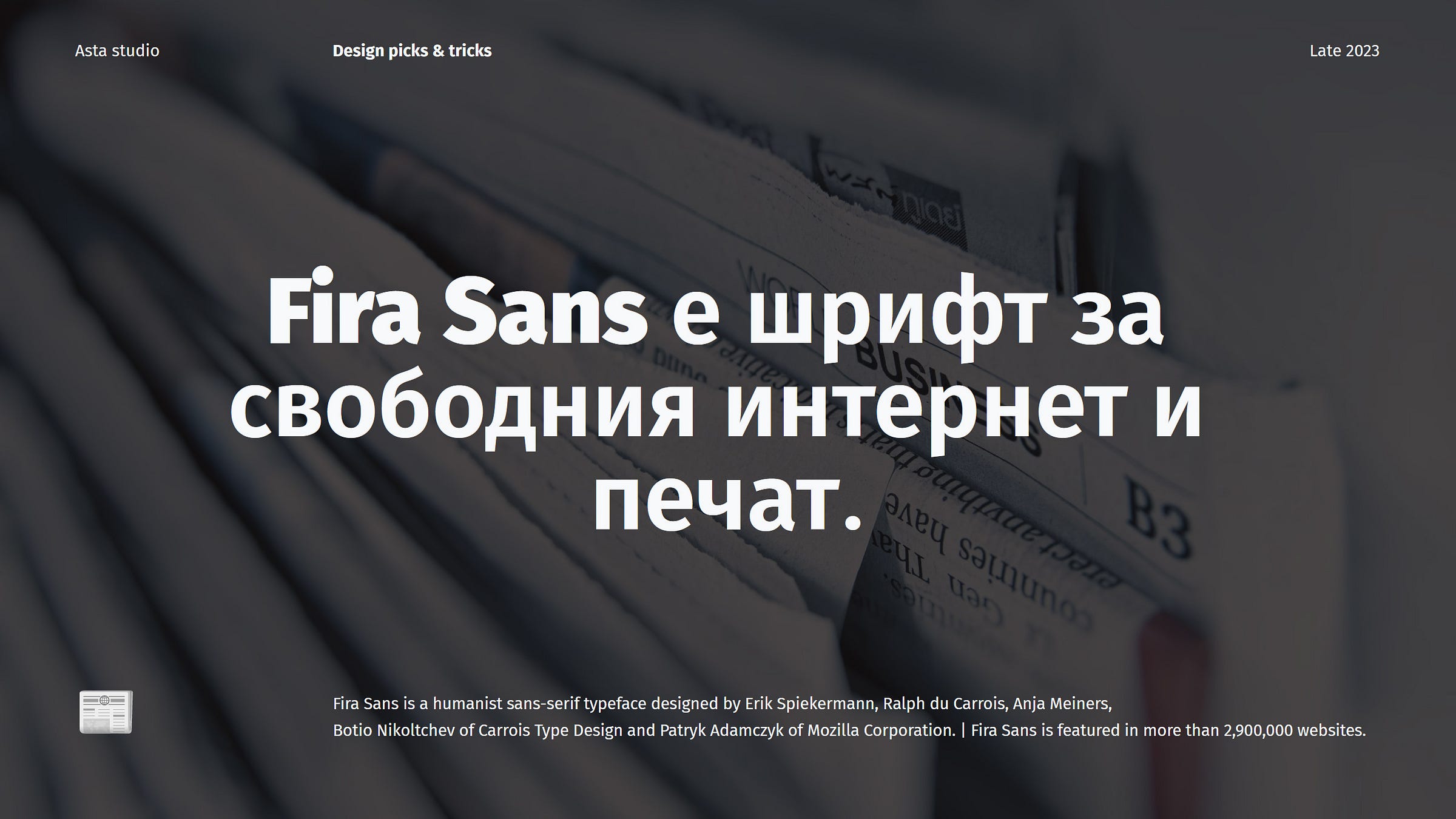
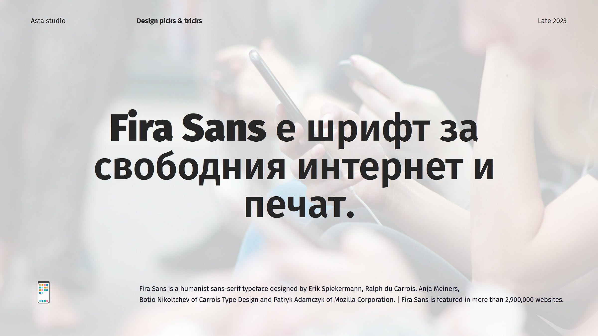
Fira Sans is an open-source and humanist sans-serif font family (Thin 100; ExtraLight 200; Light 300; Regular 400; Medium 500; SemiBold 600; Bold 700; ExtraBold 800 and Black 900, all accompanied by italic specimen). The Fira font family comes in 3 widths (Fira Sans, Fira Sans Condensed and Fira Sans Extra Condensed) and also includes a Mono Spaced variant. And let’s give the Mozilla Foundation credit for understanding that type is a valuable asset, and commissioning the right people to create it.
Fira Sans is a remarkable accomplishment, made even more impressive by the introduction of the multilingual extension called 'FiraGo' few years ago, expanding the font's character set to include Arabic, Devanagari, Georgian, Hebrew, and Thai scripts, in addition to the Latin, Greek, and Cyrillic alphabets originally featured in the typeface.
Fira Sans is the preferred font for the Governments of New Zealand and Iceland and is gradually gaining acceptance among many government institutions in Bulgaria. The reason for this lies in its close resemblance, and some argue, near perfection when it comes to representing the Bulgarian Cyrillic alphabet. While there are some differences, I'm not entirely sure what the fuss is about when it comes to distinguishing these nuances. If you're interested in learning more about the specific differences between the Bulgarian Cyrillic alphabet and the Russian one, you might find this article informative 🔗. 😋
Fira Sans stands out as the most comprehensive font family in terms of letter stroke width and character width within my Cyrillic fonts collection, I am presenting now. It serves as a reminder that creating high-quality open-source fonts is just as challenging and resource-intensive as developing proprietary fonts. In this case, the distinction lies in the fact that generous support is provided by a benefactor – Mozilla Fondation, so we must extend our gratitude to Mozilla for their contribution.
According to the Google Fonts API meter, Fira Sans is used on over 2,800,000 websites. And that’s a big number!
Application tips: Fira Sans is a versatile font family that suits the identities of businesses and institutions. It also works well for television broadcasts, as well as for print and online publishers, making it a great choice for small-scale design projects. It excels in creating a decent and honest, professional, and polite brand identity and is perfect for media and digital product content. With Fira Sans, success is achieved effortlessly and without question.
Manrope
Designed by Mikhail Sharanda, Mirko Velimirovic (Contributor) / GENT MEDIA 🔗; or Find on Google Fonts 🔗
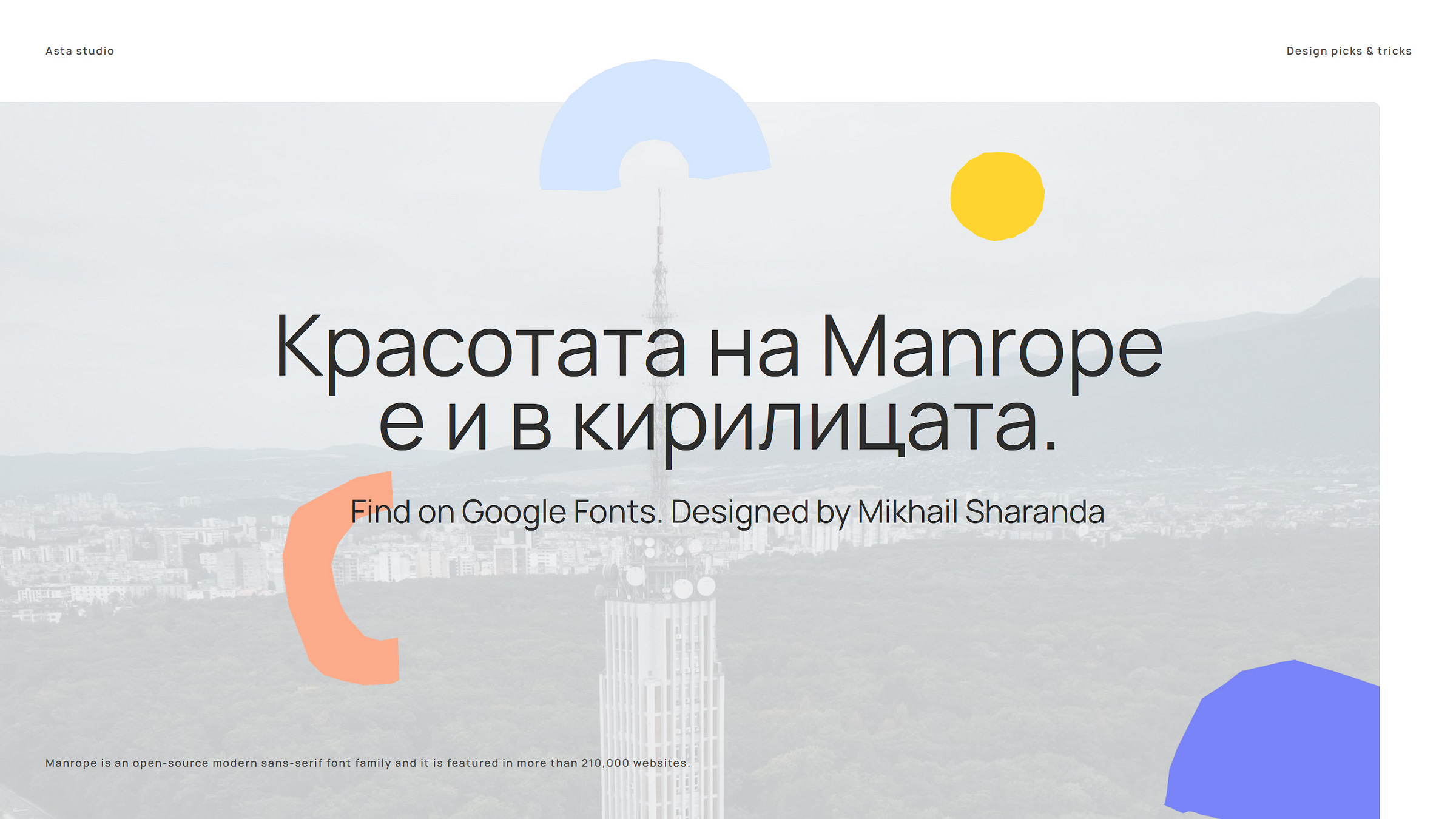
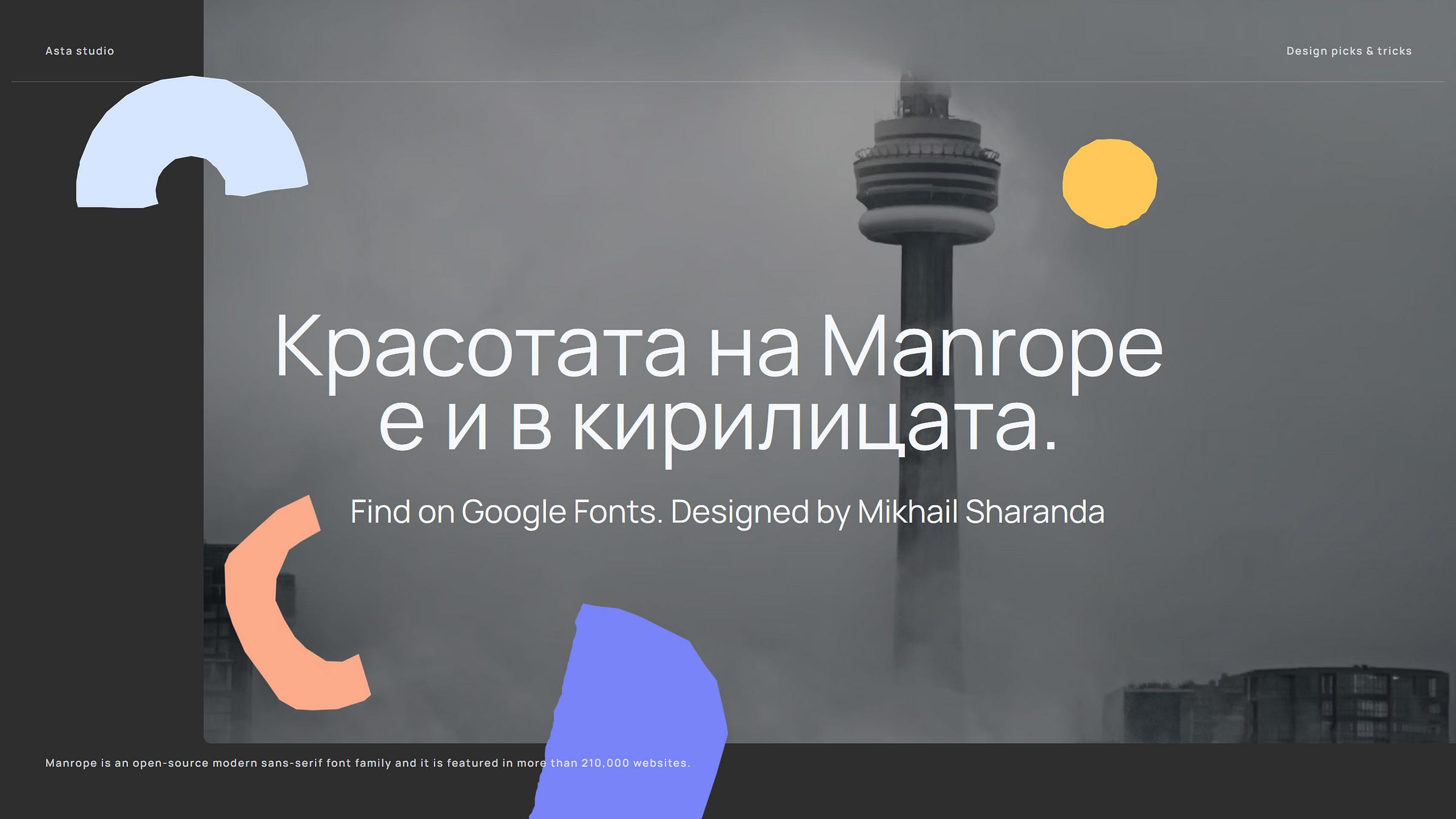
Manrope (Light 300; Regular 400; Medium 500; SemiBold 600; Bold 700 and ExtraBold 800) is a contemporary sans-serif font that caters to a wide audience. This font seamlessly blends various typographic styles, featuring elements of semi-condensed, semi-rounded, semi-geometric, semi-DIN, and semi-grotesque fonts. It maintains minimal stroke thickness variations and a partially closed aperture. Additionally, Manrope is available in both Variable Font format and seven legacy weights.
Wow, it embodies the ideal sans-serif font for me personally. I'm genuinely impressed and at a loss for words. I find it to possess all the features I seek in a flawless, straightforward, simple and user-friendly font. It reigns first in my font choices, but let's keep this between us.
Drawback: Manrope currently lacks an italic version. 😌 By the way, I couldn't find any information explaining why it lacks italics, but it might be a substantial factor for designers or brands to consider when choosing it for their identity or project.
Application tips: If you are minimal, don’t worry, nobody’s flawless, and now, we have the Manrope font available. It includes support for Cyrillic characters and that’s its most compelling selling point for me! Moreover, it's one of the newer fonts available, marking its second year.
So, if you're in search of a fresh font that includes Cyrillic support, a feature still absent in Space Grotest, and if you aim to captivate users who value innovative and unique design decisions, then Manrope is the font you've been searching for. Dive in, embrace it, and I can guarantee you'll develop a deep affection for it.
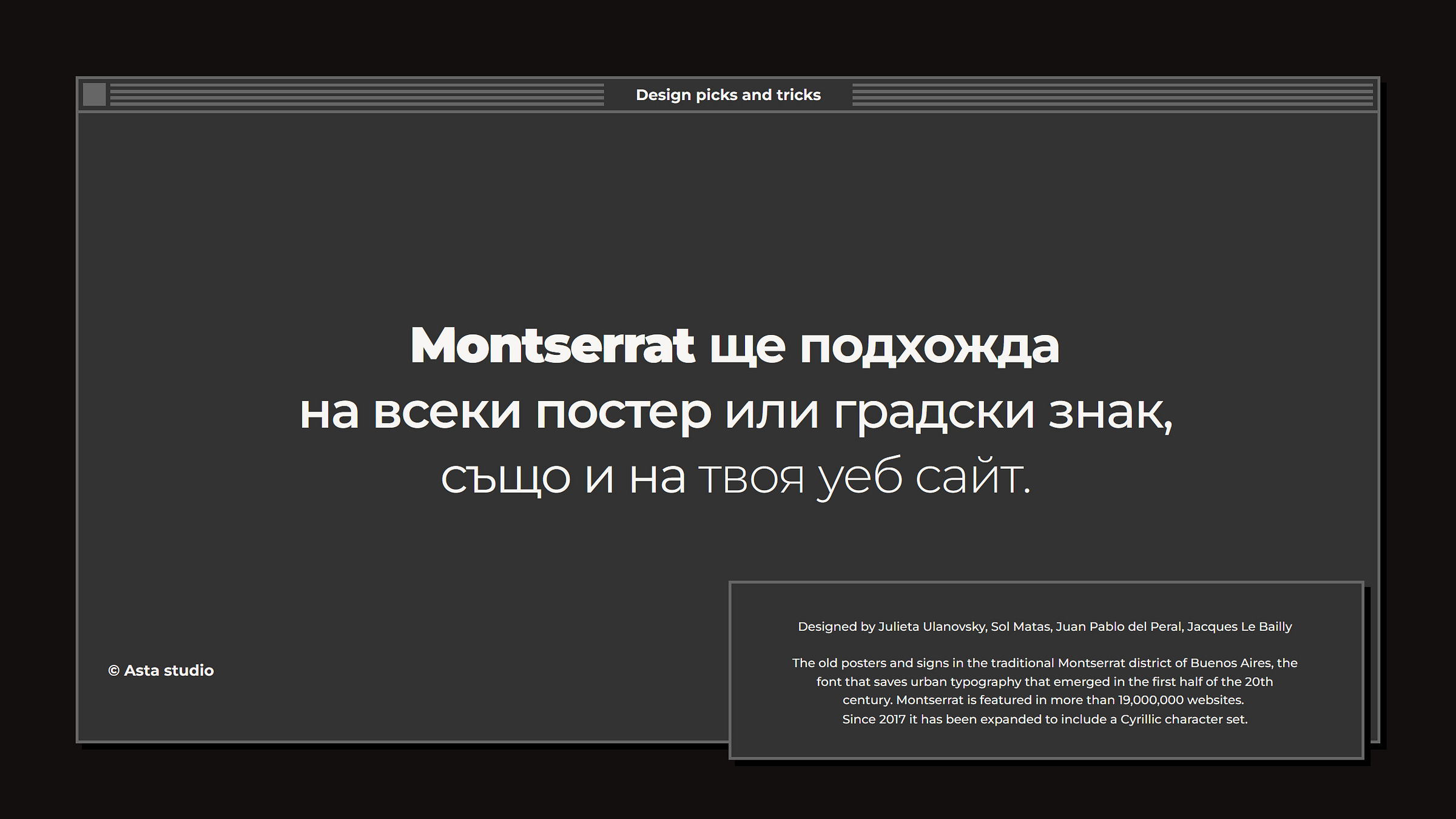
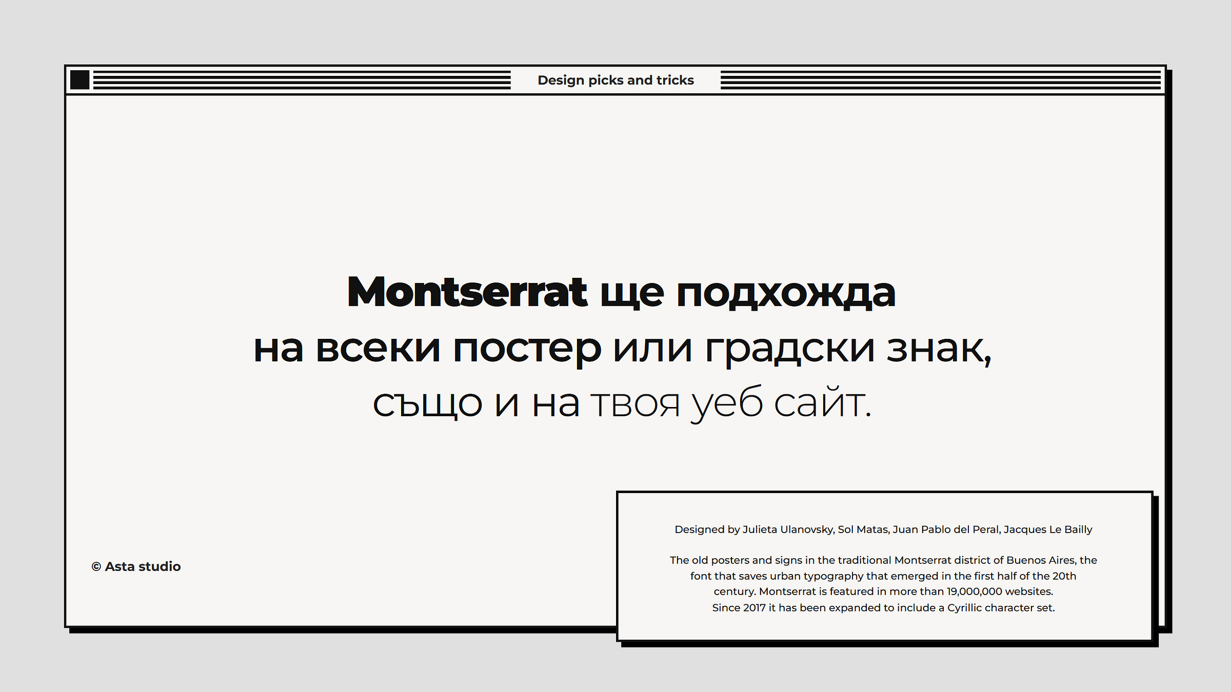
Montserrat
Designed by Julieta Ulanovsky, Sol Matas, Juan Pablo del Peral, Jacques Le Bailly; or Find on Google Fonts 🔗
Montserrat (Thin 100; ExtraLight 200; Light 300; Regular 400; Medium 500; SemiBold 600; Bold 700; ExtraBold 800 and Black 900, all with italics) is a large, modern, geometric, sans serif, open source font designed by Julieta Ulanovsky, an Argentine graphic designer, inspired by the early 20th century posters, signs and painted storefronts that were often found in the historic Montserrat district of Buenos Aires.
Montserrat can be found on over 20,000,000 websites. When it comes to web typography, Montserrat is the preferred choice, especially in cases where Roboto is the default font of a generic theme and/or typography is missing and you don't want to go there.
Although inspired by centuries-old street nameplates, Montserrat exudes a contemporary woven aesthetic.
Usage tips: Montserrat not only exudes a simple, understated yet casually elegant aesthetic that fits seamlessly into various industries and improves their online presence, but also offers exceptional readability. Its versatility knows no limits, making it the ideal choice for web designers and brand managers who want to convey modernity and sophistication to a wide audience. Additionally, Montserrat offers a range of font family options so you can customize your design with precision.
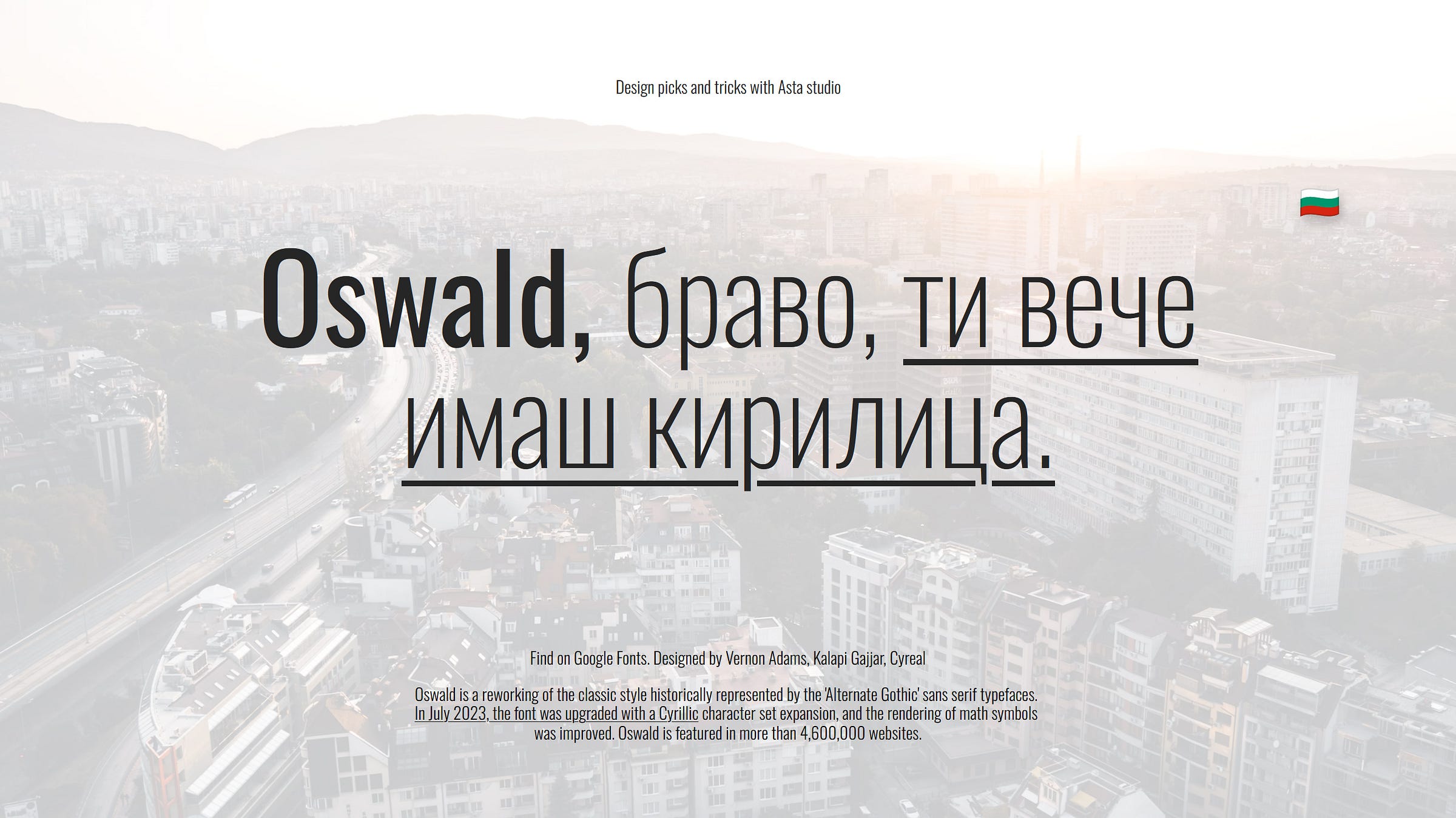
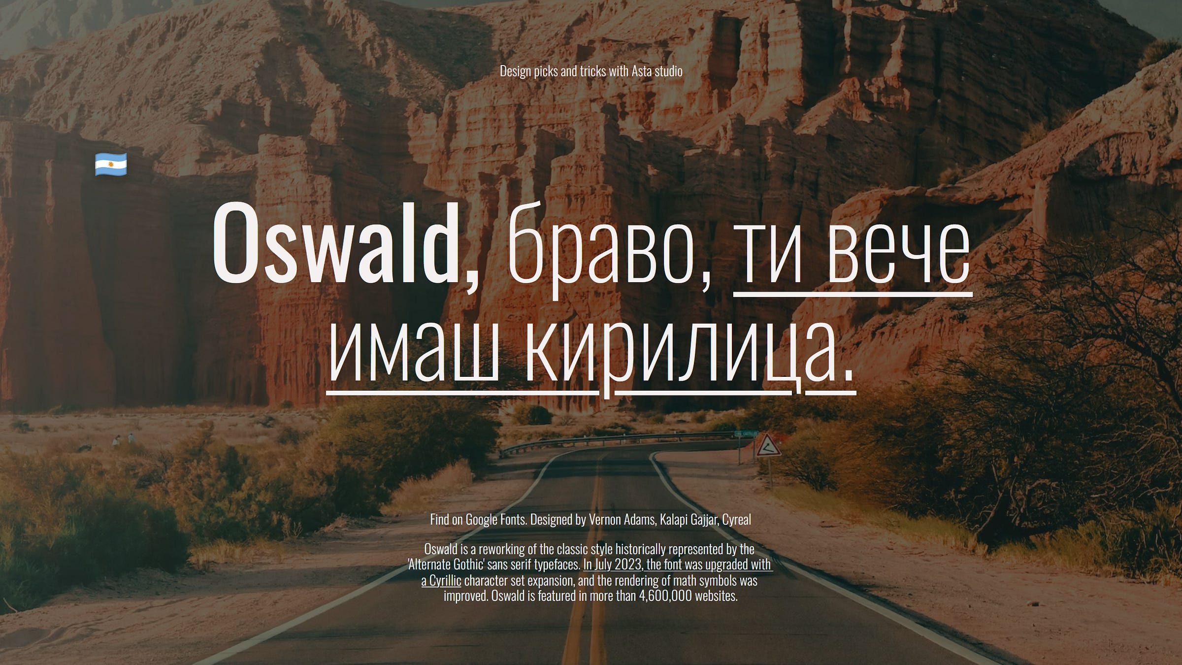
Oswald
Designed by Vernon Adams, Kalapi Gajjar, Cyreal; or Find on Google Fonts 🔗
Oswald (ExtraLight 200; Light 300; Regular 400; Medium 500; SemiBold 600 and Bold 700) is a modern adaptation of the enduring style historically represented by the 'Alternate Gothic' sans-serif fonts. Oswald is designed to be used freely across the internet and beyond. 😋
July 2023 marked a significant milestone for the font, the upgraded with a Cyrillic character set expansion. It's safe to say that this update has truly changed the possibilities of Oswald fonts and ushered in a new era of possibilities that, in my opinion, has attracted the attention and recognition of many Slavic nations.
It's now on my shortlist and I'm eagerly awaiting its debut in my next project. 🤟 I just can't wait. Because the appeal of the Oswald font lies in its innate ability to add authentic charm. Its typography ensures flawless alignment, resulting in text as polished as a perfectly strung pearl necklace. With Oswald, your content goes beyond the ordinary, reaching a level of elegance and precision, ensuring seamless alignment and delivering a visual impact that captivates readers and leaves a lasting impression.
Application tips: Oswald opens up possibilities for various applications, be it creating marketing materials or creating engaging digital content. From fitness, sports and wellness apps to science and travel literature, Oswald's elegance and simplicity not only reinforces your message but also helps you save space effectively.
Shantell Sans
Designed by Shantell Martin, Arrow Type, Anya Danilova / shantellsans.com 🔗; or Find on Google Fonts 🔗
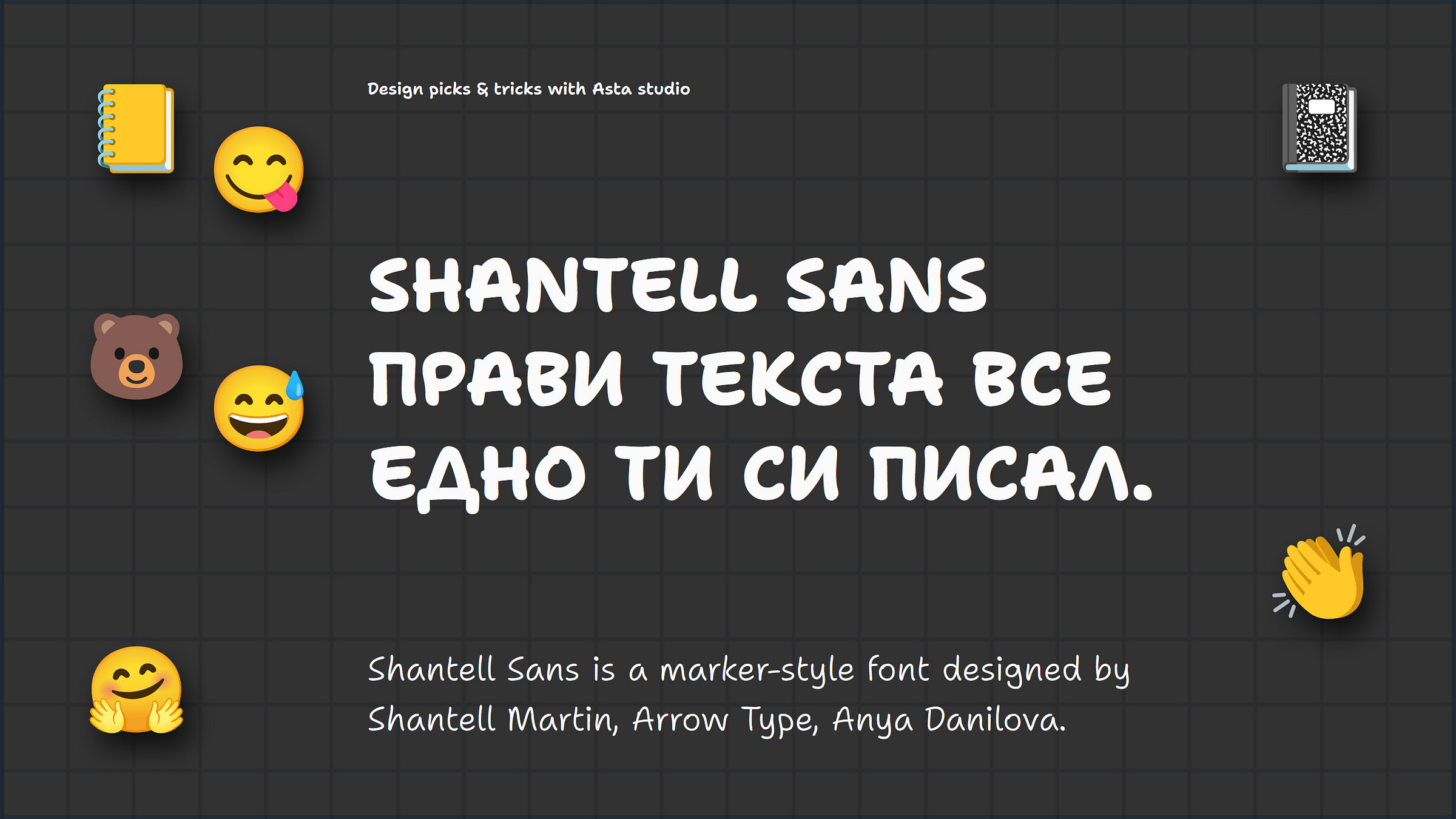
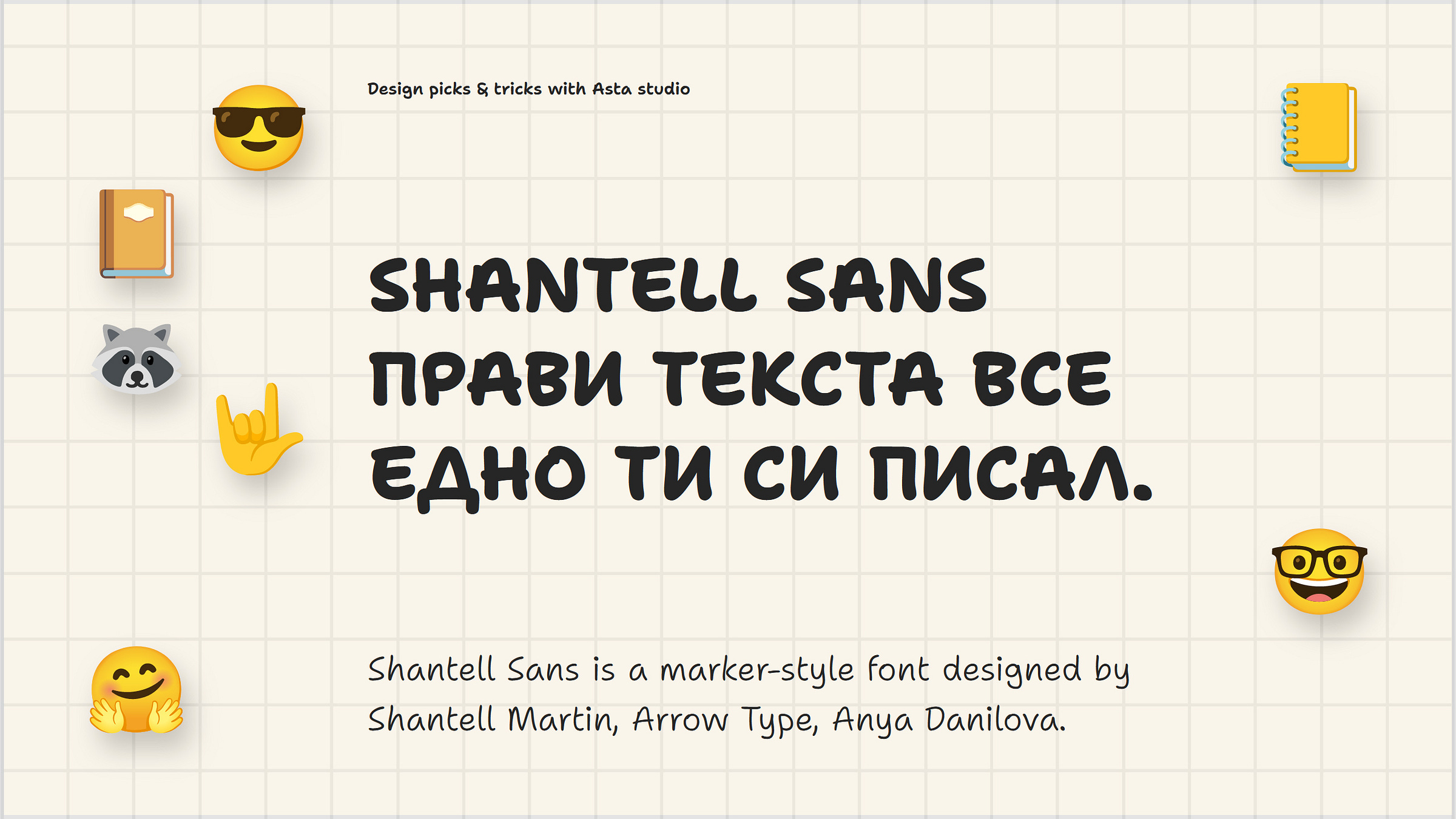
Shantell Sans (Light 300; Regular 400; Medium 500; SemiBold 600; Bold 700 and ExtraBold 800, all accompanied by italic specimen) is a hand-drawn marker font that aligns with the typical proportions and weights found in many contemporary, widely-used sans-serif fonts, making it a versatile choice for designers suitable for a broad range of projects application.
No need for unnecessary words; Shantell Sans has everything you want in a marker font. The surprise? It is open source and supports the Cyrillic character set. Yay! 🥳 Exciting news, right?
Application tips: Every school child should embrace the font and enjoy it. Manuals and books for children, educational games and apps—they should all feature it. Anyone who is young at heart, down to earth, raw and empathetic should use it. Any brands targeting a fun, casual street audience should make this font their choice.
Sofia Sans
Designed by Lettersoup, Botio Nikoltchev, Ani Petrova / lettersoup.de 🔗; or Find on Google Fonts 🔗
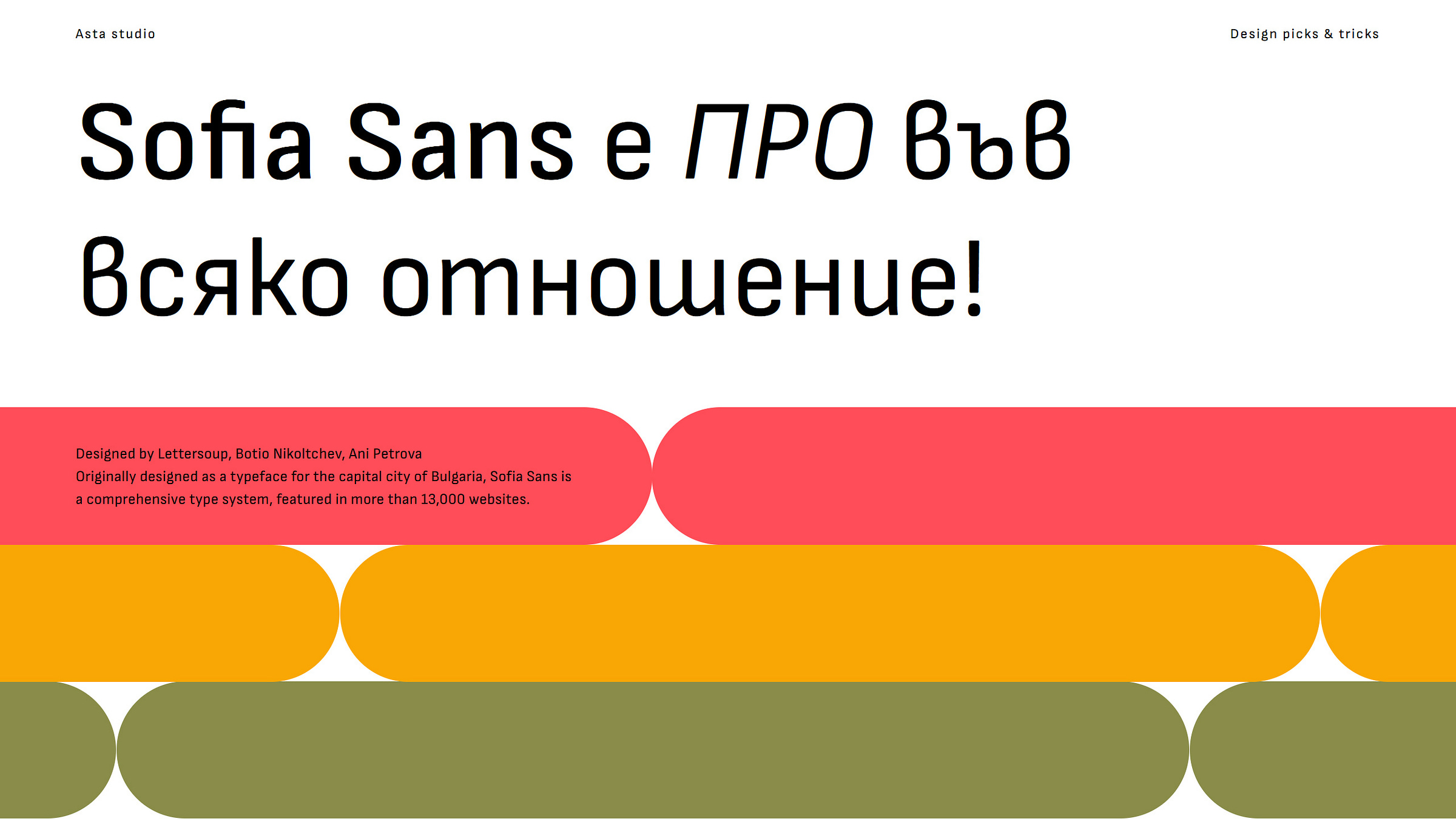
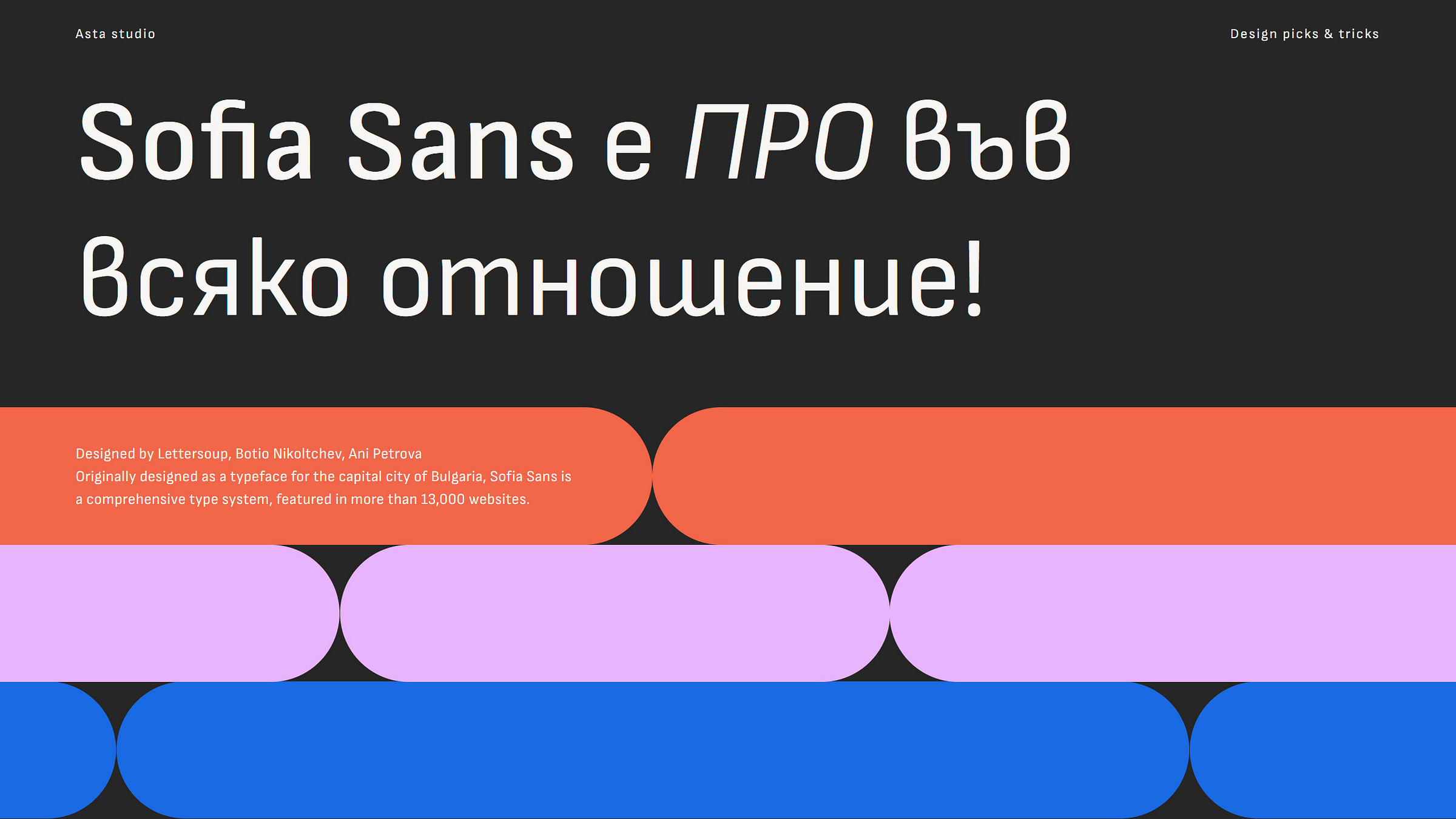
Sofia Sans (Thin 100; ExtraLight 200; Light 300; Regular 400; Medium 500; SemiBold 600; Bold 700; ExtraBold 800 and Black 900, all with italics), originally designed as a font for the capital of Bulgaria, a comprehensive type system divided into four Widths available (Normal, SemiCondensed, Condensed and ExtraCondensed). It offers extensive support for the Latin, Greek and Cyrillic characters and is inspired by technical sans serif fonts.
While there's a captivating story behind the development of the Sofia Sans font and its journey to becoming the official typeface of the Bulgarian capital 🔗, the font itself holds immense potential. With proven success, now it has already found a home in over 13,000 websites. So, don't miss the chance to explore its features and make it a part of your next project. Sofia Sans seamlessly fuses technology and geometric aesthetics, offering a flawless balance that infuses your work with strength and a highly professional appearance.
Application tips: Sofia Sans has earned its place among my top 8 Cyrillic typefaces, standing out as a distinctive and authentic addition to the compilation here. It seamlessly complements tech websites, medical, science, and sports-related content. Additionally, its various condensed widths make it an excellent choice for info-graphics, allowing you to handle, squeeze and display text with precision.
Tada! Finally, the conclusion and reflections follow.
Compiling a Cyrillic font selection was an appealing endeavor, especially given the recent rise in competition. The collaborative efforts of talented designers have eased the challenges of publishing and developing fresh and professional fonts that today seamlessly integrate the Cyrillic alphabet. Gone are the days when printed and digital content appeared inconsistent in all language versions due to missing Cyrillic characters in the fonts.
Until a decade ago, graphic designers worked in a highly competitive environment where paid fonts were often used to stand out from the crowd rather than to create with passion and open source principles. Today it's a different story. Designers are now part of a community that encourages inspiration and collaboration, putting collective benefit over individual gain when it comes to fonts. This marks a new era in which Latin and Cyrillic scripts coexist harmoniously, contributing to a more visually appealing digital world. 🤗
In the field of design, it is important to recognize that while font is undoubtedly important, it serves as a tool, but should never overshadow the personality of the brand and the power of its message. Instead, it should harmonize with and reinforce the inherent strengths of the brand and product to ensure that the audience remains focused on what matters most: the content of the message and the authenticity of the brand identity. In a world full of visual stimuli, the resonance of the messages and the personality of the brand must shine through, be guiding and captivating, while the typeface plays a supporting and complementary role in the storytelling process.
Thank you very much. It was an emotional topic for me. Write me a comment, say hello and feel free to share my writing and use these 8 undoubtedly cool fonts.
P.S.: Lastly, the visuals for the article were created in a Pitch presentation that can be swiped and bookmarked. 🔗 This article will be translated into Bulgarian as soon as possible. 🤗


